I seem to have sadly neglected this blog for the last month or two. Personal projects and my day job took the driver’s seat in my design life, but I’m ready to start posting again!
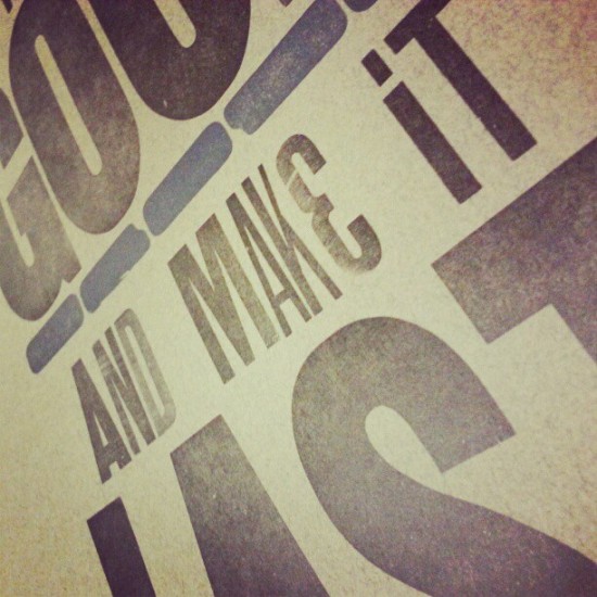
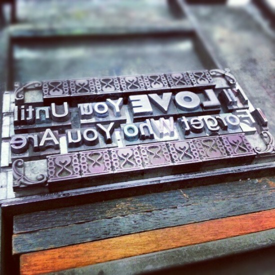
Lately I have been working a lot on letterpress projects. Here are some photos of some typesetting on press! If you live in NYC and would like to try your hand at some letterpress work, check out The Arm in Brooklyn!
I am convinced that there is nothing in the world that compares to pulling a fresh print off a press.
Stephen Bayley is a British design critic, cultural critic and author. He is also responsible for the implementation of the much loved London Design Museum.
In the wake of the London 2012 Olympics his criticism on merchandise and its relation to the visual excitement and experience of the 2012 Olympic Games brings a much needed twist to our normal perception of the events. While I don’t normally post editorial content or opinions, and while Bayley’s criticism might be filled with humor and ubiquitous sarcasm, I believe that beyond his colorful personality is an important message to the design world.
When he speaks about the Olympic merchandise being sold in London, he states that the choice of product “Assumes a very low level of intelligence amongst the public.” Regarding the image seen below, he then asks “How is the person who consumes this bit of ‘tat’ going to be changed or enhanced by possession of it? It’s ugly, it’s cynical, it’s stupid.” As he tosses the product onto the ground I can’t help but agree with what he is saying.
He explains many examples of souvenir commodities as ‘patronizing, exploitative and useless.’ The products contain a message slapped haphazardly onto a preexisting form with preexisting connotations. From my perspective, the only reason these products are consumed is because of the text written on them. Merchandise, giveaways, and promotional items are often an afterthought in the design process. They are created after the implementation of a design system, often by a third party. Many items sold that are commemorative or nostalgic in purpose often require no level of thought, and represent nothing close to a personalized experience. They simply act as successfully as would a sign that reads “I was in London and the Olympics were happening.” Why is it that this would be less impressive to bring home than a snow globe essentially communicating the same message.
As a designer I am constantly thinking about how we can enhance our experience in this world, and I believe for many people these experiences are hard to recognize. They often happen in our subconscious and many do not realize how much our visual world affects our human experience. It is important not to dumb down our culture with what is familiar and easy. We should always strive to think and create new experiences for the masses. That is our job as designers and communicators and the minute we give up on that goal, our culture is bound to suffer.
I support many of the design decisions made during this summer Olympics. For 5 years I have heard the negative feedback regarding the Olympic Logo and identity system. While there are always things that could have been done better, I support London and their vibrant design community for challenging the public to think outside the box.
[via YouTube & Vice Magazine]
You can see more of this Vice Magazine trailer below;
The Times has created an impressive infographic visualizing the modern Olympic results, in three events, during the 116 year history of the modern games. Visualized are the long jump, the 100m swimming freestyle, and the 100m dash. Each chart shows where past Olympians would stand at the time of the top competitors finish.
It is fascinating to see how much better, faster, and more determined we have become. Some of these accelerated results may stem from pure human achievement, and some may stem from advances in technology and evolution of the game in question, but whatever the reason these graphs are a reminder of the greatness we can achieve. All in all, it is a wonderful visualization.
[via The New York Times]
This year at the London 2012 Olympic Games when one of these clay discs is shot a pink powder bursts into the air. It is likely for entertainment and judging purposes but whatever the reason, it is absolutely gorgeous! The way the game is played, two throwing machines at different heights launch a series of targets in a specific order, some as singles and some as doubles, with the shooter having a fixed position between them. It is very enjoyable to watch! [via Eurosport]